Booking Table App
"I need an easy way to book a table in a cafe while travelling to foreign countries"
Click here to see the prototype
• Summary:
• Challenge
I wanted to create an app for both native and foreigners who are visiting Vienna.
My goal was to make the whole experience of booking a table as pleasant and as easy as possible.
I wanted to understand what kind of challenges users might face and give them the best user experience possible.
• The problem
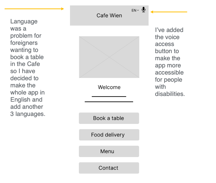
Foreigners had problems with booking the table in a language other than English.
Some people with disabilities couldn’t see the letters on the apps and there weren’t the voice control option available.
• The goal
Designing an app that is easy to use for both people with disabilities and people from different countries.
• User pain points:
Accessibility:
Foreigners have difficulties to book a table if they don’t speak the local language.
Process:
The checking process on booking platforms is usually too complicated to follow.
IA:
Text is usually too small to read especially for people with vision problems.
I have conducted a competitive audit where my goal was to compare "booking a table" experience of each competitor's app.
My key competitors were Cafe Central, a very famous cafe place in Vienna and two indirect competitors
- Skybar Steffl and Italian restaurant also from the same city. I found some strengths and weaknesses in each of the competitors.
The main takaways from the whole audid are : in order to be really competitive, cafe's need to provide audio
feature and images in the menu and at least 2 language version
The whole competitive audid is available to read over here. Journey map and close-up story board are avaliable here and here.
• Startig the design:
● Paper wireframes
● Digital wireframes
● Low-fidelity prototype
● Usability studies
• Paper wireframes
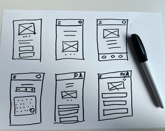
I was trying to figure out what would make the whole process of booking a table easy and quick.
I’ve had a few ideas, eventually I have decided to go with the one that has an option to switch the language and has the voice assistant button included.
• Digital wireframes
As the initial design phase continued, I made sure to base screen designs on feedback and findings from the user research.
Click here to see more of my digital wireframes.
• Low Low-fidelity prototype
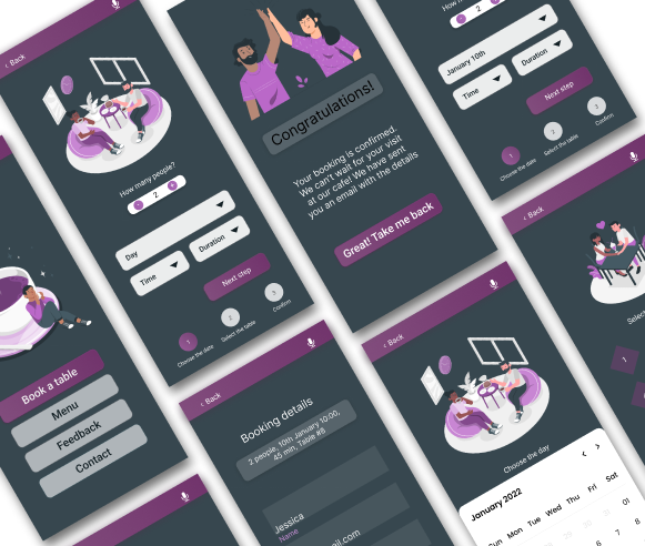
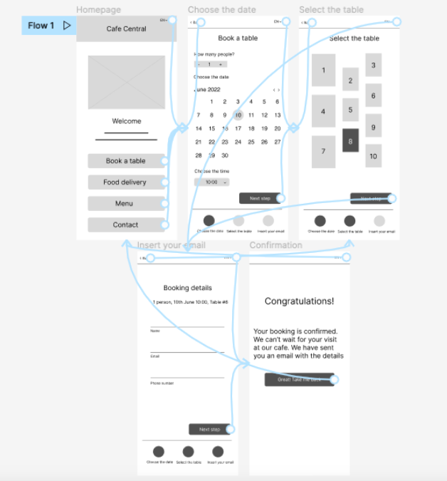
Using the completed set of digital wireframes, I created a low-fidelity prototype.
The primary user flow I connected was to book a table, so the prototype could be used in a usability study.
• Usability study: findings
I conducted two rounds of usability studies. Findings from the first study helped guide the designs from wireframes to mockups.
The second study used a high-fidelity prototype and revealed what aspects of the mockups needed refining.
Round 1 findings:
1. User want an easy and fast booking process
2. User wants to be able understand the language
3. Users want more customization options
Round 2 findings:
1. The checkout process was not clear enough
2. The voice access button was placed in the wrong area
3. The calendar could have been more clear
More detailed usability study is avaliable here.
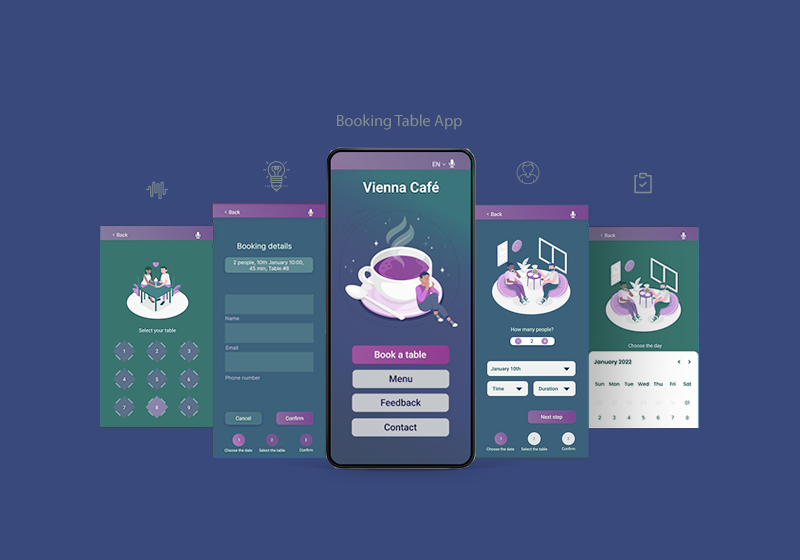
• Mockups
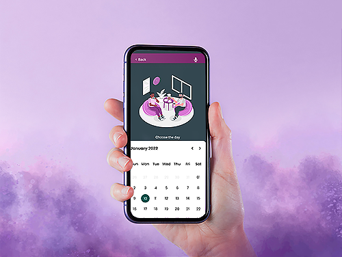
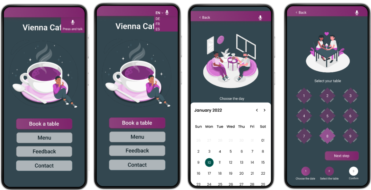
Early designs allowed for some customization,
but after the usability studies, I have decided to change the calendar so
now the user can clearly see what day of the week his booking occurs on.
I have also moved the voice access button and the „change language” button a bit lower and made them bigger so the users can spot them right
away. Furthermore, I have used colors that are high in contrast to make the whole design even more accessible.
The final high-fidelity prototype presented cleaner user flows for booking a table at Vienna Cafe.
It also met user needs for including days of the week in the calendar as well as language switch and the voice access icon.
You can find the prototype here.
• Accessibility considerations
1. Provided access to users who are vision impaired through using bigger font size and adding the voice access button.
2. Making sure that the colors of the buttons and background as well as the
text are in the right contrast for the user to have the best possible experience.
3. Making the checkout process very smooth and simple to follow. Adding the days of the week into
the calendar to make it even easier for the users to book the right date.
• Takeaways
Impact:
The app makes users feel like Vienna Cafe really thinks about how to meet their needs.
One quote from peer feedback:
“The app made it so easy to book a table. Before I was hesitant to use this type of apps in a non English speaking country because
I thought they would be only providing their service in a local language, but using this one I can switch between 4 different languages!”
• What I learned:
It was my very first project. While designing the booking table app, I learned that the first ideas
for the app are only the beginning of the process. Usability studies and peer feedback influenced each iteration of the app's designs.